

The article features Brandon Flowers, who is a former member of the Killers. He is a Pop artist therefore this article would appeal to people that like pop, however the band Killers is well known, so the article would appeal to a wider range of audience, since he still belongs to the group of people ‘the most exciting people in music’. This would grab the attention of any person who is passionate about the industry of music.
The language used is sophisticated and the text contains a lot of factual information about Brandon Flowers’ life. Although the article circles around Brandon’s music career it reads a lot like a biography of his life.
The article has an interesting narrative, a blend between an article and an interview. It writes about Brandon in a third person and then it would shift to an interview mode. Unlike the interviewer’s questions, Brandon’s answers would be quoted. This gives an illusion to the readers that they are talking to Brandon Flowers in person and this helps the audience to form a relationship with the artist and see him as an honest approachable person. The questions would be rather intimate and related not only to music, but also family and life. For example in the context of Brandon’s family history, his dad being an alcoholic and his current family life, Q asks ‘You fear the family demon within?’; or when speaking about his previous best friend Trevor Gagner, the question ‘What happened to Trevor?’ pops up. So really these are genuine questions that help the reader to see Trevor as a human being rather than a distant figure in the industry of music.
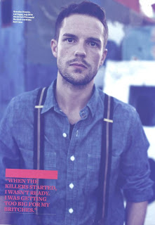
According to the article, Brandon Flowers completely gave up alcohol and smoking and he is devoted to religion. However he still feels tied to Las Vegas which seems unusual since this is a Sin City. The pictures used for the article are interesting contain inter-textual reference about the contrast between Brandon and Las Vegas.
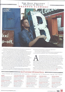
In one picture he is surrounded by the well lit ‘ruins’ of Las Vegas. This suggests that the whole idea of Las Vegas- exciting shows, casinos, and the rush is all in the past. However he still sees Las Vegas as his home, he still sees brightness within it. His pose presents him as powerful and this links to the caption ‘man on a mission’ and ‘he’s still got God on his side’. Another picture is a mid-shot with the camera at an eye level. This represents Brendan as an equal to the reader emphasising the friendly and human like nature of the artist. The direct mode of address captures the reader’s attention and suggests honesty. Other photographs visually inform the reader about Brendan Flowers’ life, for example an image of him graduation, photograph of him and his wife and a concert image.
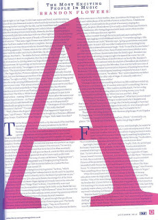
The colour scheme consists of three main colours; white, red and black. White is mainly used as a background for the white black text, which makes the text easy to read. Red is an eye-catching colour which is used for important quotes and it is also used as a text highlight for Brandon’s name in the opening paragraph.
The magazine keeps a consistent house style by the use of colour. Both the front cover and the article have the same colour schemes and the article has the logo of the magazine on every page.
The magazine keeps a consistent house style by the use of colour. Both the front cover and the article have the same colour schemes and the article has the logo of the magazine on every page.
The magazine keeps a consistent house style by the use of colour. Both the front cover and the article have the same colour schemes and the article has the logo of the magazine on every page.
The magazine keeps a consistent house style by the use of colour. Both the front cover and the article have the same colour schemes and the article has the logo of the magazine on every page.
The whole article is written in a simple black text similar to Times New Roman, this makes it easy to read. The first letter of every paragraph begins with an enlarged letter making it clear when the new paragraph is starting and it also make the article pages look more interesting. The quotes are written in capital bold red letters and this makes the text stand out from the rest and easily catches reader’s eye.
We can see that the magazine represents this artist as someone really important because the first double page is taken up by Brendan’s image and a short introduction to the article. The rest of space is equally divided between text and images. This helps the magazine to appeal to both types of audiences- the ones who prefer text and the ones who prefer images. I would say the article maintains a good balance between the two.


No comments:
Post a Comment