
Wednesday, January 4, 2012
Tuesday, January 3, 2012


My Title Block Designs


I have created these Title Blocks using Serif Draw, this program allowed me to manipulate the text, make it 3D. Also I was able to group different components together and this allowed me to create a unique eye catching Title Block.
The third design is my favourite because it looks the most professional. The reason for that is the fact that it appears more continuous since it consist of only two colours, black and white; while the other two contain red as well which tends to bring out the 'R&B' part and the rest of the text appears to not fit in.
Furthermore the reason why I chose it is the curvy and slim nature of the font which is quite feminine and this links to my R&B artist Jasmine who is a girl.


Audiences & Institutions

Bauer Media Group is a multinational media company which operates in 15 countries worldwide and this indicates that Bauer owns a variety of different media brands. In fact it is responsible for around 150 different magazines including one of the major music ones like Q, Mojo and Kerrang. It also owns 24 radio stations and a variety of music channels. I have visited www.bauermedia.co.uk to see who are the major target audience for Bauer, however although this company owns a lot of Media that is related to music, it also owns magazines and other media that are aimed at a completely different audience. The companies are put into different categories which include: Women's, Men's Entertainment, Men's Lifestyle, Gardening, Photography, Pets and many others. Bauer is flexible when it comes to target audiences because it is responsible for companies that are aimed at different audiences, both male and female.

BBC Magazines is a mainstream company that produces niche magazines which target specific audiences. These include 'CBebbies Weekly’, 'Top of the Pops' and 'Top Gear' and you can see how different these magazines are, this straight away shows how the company publishes a variety of magazines to target a lot of different groups of audiences. Although BBC Magazines Company is owned by Immediate media, it is pretty powerful on its own. This is because BBC has its own well known channels and some of them are worldwide. Also BBC Magazines have magazines that, similar to IPC Media, targets different groups of the society- kids, teenagers, adults men and women.

Development Hell Ltd is an independent media company which only publishes two magazines: Mixmag and The Word. It is also responsible for DontStayIn.com, the world's biggest clubbing social network. Compared to the other media groups such as Bauer this company is very small and it targets a narrow group of audience. The Word is a magazine that contains information on different types of media, like films, TV shows and music and this does actually attract a variety of audiences. However Mixmag is based on music therefore it will have a smaller audience.

IPC Media is another media group, which according to my research, produces over 60 iconic media brands. It targets a wide group of people, with a focus on three core audiences: men, mass market women and upmarket women. Magazines that target men group are Country Life, Horse & Hound, Rugby World and Decanter, as well as lifestyle brands including Nuts, Mousebreaker and NME. Mass market women’s brands are Look, Now, Chat and Woman; and at last the magazines aimed at upmarket women’s division are Marie Claire and InStyle, lifestyle brands including woman&home and essentials and home interest brands including Ideal Home, Livingetc and Housetohome.
IPC Media is responsible for only few music related media productions therefore this company does not particularly target the audience that is interested in music. It generally has magazines that either aim at men or at women.
The Title Block Analysis

The logo has been composed of three letters NME which stand for New Musical Express; therefore it is obvious that this is a music magazine. On the other hand the logo does not tell much about the genre of the magazine. However the white, red and black colour scheme makes it look dramatic and hence it makes me think of rock type of music, since rock used to be seen as something dramatic and rebellious.
As I have mentioned before the colour scheme of the logo consists of white, red and black. Black and white together creates an eye catching effect and looks quite striking. This creates a memorable effect which benefits the recognition of the magazine, since the audience will effortlessly remember the magazine once they see this striking logo.
The font used is quite sharp and edgy. This looks quite masculine and this supports my previous assumption that the music genre of this magazine is rock, since stereotypically mostly men are part of rock bands. Let’s say this was a POP magazine which would be aimed at girls, I would expect the writing to be thin, curvy and italic. However since it is rather square shaped it appears to suggest masculinity.
The magazine has been names as ‘New Musical Express’, which sounds like a newspaper title due to the word ‘express’. This infers that the magazine contains news and recent information about music. Also the word ‘express’ suggests that it has a weekly release. However the general title has been cut down to the three letters NME and supposedly this makes it easier for the audience to remember the title.
I think that the target audience for this magazine would be people who are interested in music and want to know what is happening in the music industry. I would assume that this magazine contains a lot of news and information since it’s titled the ‘New Musical Express’.

According to my research ‘Kerrang!’ is an onomatopoeic word that derives from the sound made when playing a power chord on an electric guitar. Since this word is chosen for a title block, it must mean that the genre of this magazine is Rock because the electric guitar is one of the most significant instruments that are used to create rock music. The title has been written in capitals and it has an exclamation mark. This emphasizes on the loudness of the onomatopoeic word. Furthermore, the font looks fractured; this suggests the fracture that has been caused by an extremely loud noise that Rock music consists of. The contrast created between the white background and black text is the reason why the logo stands out.
The logo makes it clear what type of audience the magazine is intending to attract. Since the magazine is named after the sound that is made when playing a power chord on an electric guitar, it is clearly aimed at people who are interested in rock, and would actually know what ‘Kerrang’ means. Therefore the target audience for the magazine are people who are interested in Rock artists and their music.

You are not able to tell what genre the music magazine is based on just by looking at the logo of this magazine. However the possible reason for this is that the magazine is based on a variety of different genres and therefore it is not aimed at any particular group of audience. The logo consists of a single letter ‘Q’ which does not seem to imply any connotations of music, although on the other hand ‘Q’ sounds like a question. Therefore this suggests that the magazine is full of answers to question. I have looked at this magazine in my previous analysis and I noticed that it actually does contain a lot of reviews and interviews with music artists.
However according to my research, originally the magazine was called ‘Cue’, in the sense of cueing a record, ready to play, but it was simplified into ‘Q’ because a single-letter title would be more prominent on the newsstands. And as far as I’m concerned having one letter as a title makes it more memorable and therefore the audience will recognise it effortlessly.
The font used for ‘Q’ looks really simple and general, it’s neither feminine nor masculine and it doesn’t seem to represent any specific music genre. This emphasises the idea that the magazine is aimed at anyone. The chosen colours red and white work together to make the logo look eye-catching. The red background grabs the audience’s attention and sets the focus on the ‘Q’.
Planning My Music Magazine
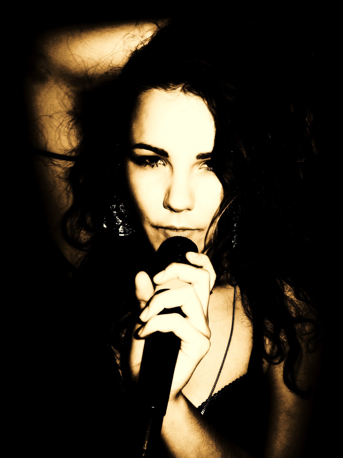
The intended audience for my magazine are R&B music fans aging from 16 to 19, who have been brought up in the big city environment and know all about the urban life; urban teenagers as I like to call them. There are many reasons for my choice. Firstly I belong to this group of our society; hence this helps me to understand what is relevant to such population. It helps me to make decisions on choices like price, contents and the genre of music my magazine will be based upon- because I know what I would be willing to pay for a music magazine, and what I would be expecting to see inside it. Furthermore since my survey was completed by college students, the results were only so much relevant if I was making a magazine that targeted that particular age group. Although I have expanded the age range from 16 to 19, I have still used the results as my guide when it came to developing my music magazine.
After observing the results I have noticed that the majority of teenagers prefer genres of R&B and Hip Hop over any other style of music. So, since I want my magazine to be mainstream among teenagers I have decided to base my product on R&B.
According to my survey, the majority of the people who completed my survey would expect to pay 3.99 for a good music magazine; however it would be harder to sell my magazine to teenagers if I actually chose this price. Most of teenagers can’t afford that, or rather would not bother spending this much on a magazine. Hence, 2.99 is my chosen price.
My magazine will be released monthly because this was the most voted option in the survey and also this solves the money problem that a lot of teenagers have. A 16 year old would prefer to spend £2.99 on a music magazine once per month, rather than twice or more.
I want my product to appeal to as many people as possible and there is nothing better than a magazine that looks eye pleasing and professional, therefore I would prefer my magazine to be glossy, like the Q magazine. The glossy material is much more durable and nicer than the newspaper like material which is cheap and easily damaged.
Double Page Article Analysis


The article features Brandon Flowers, who is a former member of the Killers. He is a Pop artist therefore this article would appeal to people that like pop, however the band Killers is well known, so the article would appeal to a wider range of audience, since he still belongs to the group of people ‘the most exciting people in music’. This would grab the attention of any person who is passionate about the industry of music.
The language used is sophisticated and the text contains a lot of factual information about Brandon Flowers’ life. Although the article circles around Brandon’s music career it reads a lot like a biography of his life.
The article has an interesting narrative, a blend between an article and an interview. It writes about Brandon in a third person and then it would shift to an interview mode. Unlike the interviewer’s questions, Brandon’s answers would be quoted. This gives an illusion to the readers that they are talking to Brandon Flowers in person and this helps the audience to form a relationship with the artist and see him as an honest approachable person. The questions would be rather intimate and related not only to music, but also family and life. For example in the context of Brandon’s family history, his dad being an alcoholic and his current family life, Q asks ‘You fear the family demon within?’; or when speaking about his previous best friend Trevor Gagner, the question ‘What happened to Trevor?’ pops up. So really these are genuine questions that help the reader to see Trevor as a human being rather than a distant figure in the industry of music.
According to the article, Brandon Flowers completely gave up alcohol and smoking and he is devoted to religion. However he still feels tied to Las Vegas which seems unusual since this is a Sin City. The pictures used for the article are interesting contain inter-textual reference about the contrast between Brandon and Las Vegas.
In one picture he is surrounded by the well lit ‘ruins’ of Las Vegas. This suggests that the whole idea of Las Vegas- exciting shows, casinos, and the rush is all in the past. However he still sees Las Vegas as his home, he still sees brightness within it. His pose presents him as powerful and this links to the caption ‘man on a mission’ and ‘he’s still got God on his side’. Another picture is a mid-shot with the camera at an eye level. This represents Brendan as an equal to the reader emphasising the friendly and human like nature of the artist. The direct mode of address captures the reader’s attention and suggests honesty. Other photographs visually inform the reader about Brendan Flowers’ life, for example an image of him graduation, photograph of him and his wife and a concert image.
The colour scheme consists of three main colours; white, red and black. White is mainly used as a background for the white black text, which makes the text easy to read. Red is an eye-catching colour which is used for important quotes and it is also used as a text highlight for Brandon’s name in the opening paragraph.
The magazine keeps a consistent house style by the use of colour. Both the front cover and the article have the same colour schemes and the article has the logo of the magazine on every page.
The magazine keeps a consistent house style by the use of colour. Both the front cover and the article have the same colour schemes and the article has the logo of the magazine on every page.
The magazine keeps a consistent house style by the use of colour. Both the front cover and the article have the same colour schemes and the article has the logo of the magazine on every page.
The magazine keeps a consistent house style by the use of colour. Both the front cover and the article have the same colour schemes and the article has the logo of the magazine on every page.
The whole article is written in a simple black text similar to Times New Roman, this makes it easy to read. The first letter of every paragraph begins with an enlarged letter making it clear when the new paragraph is starting and it also make the article pages look more interesting. The quotes are written in capital bold red letters and this makes the text stand out from the rest and easily catches reader’s eye.
We can see that the magazine represents this artist as someone really important because the first double page is taken up by Brendan’s image and a short introduction to the article. The rest of space is equally divided between text and images. This helps the magazine to appeal to both types of audiences- the ones who prefer text and the ones who prefer images. I would say the article maintains a good balance between the two.
Front cover and the contents page analysis
Front Cover of the Q magazine

This is the front cover of the ‘Q magazine’. This is a music magazine that is based on the music industry and the people who are a part of it. According to the cover lines the magazine contains 42 pages of reviews and 10 exclusive interviews of the 10 “most exciting people in music now”. These include Jay-Z, Lady Gaga and Dave Grohl.
Their names are written on the front cover in capital letters in a bold and exceptionally large font and the red bright colour stresses their importance. Due to this, the text appears extremely eye catching. Under each name of the artist there is a short quote from their interview which gives us a taste of what the interview is going to be about, hence it intrigues the audience.
This is a music magazine and the cover lines suggest that the content revolves around the world of music therefore the target audience are the people who have interest in music. It does not target a specific age group because people can listen to music at any age. However the magazine appears to contain a lot of text especially the 42 pages of reviews. Teenagers up to 16 years old are not interested in reading this high quantity of text. Hence this magazine would appeal to readers who are 16 or older, although the majority of the senior population would not be intrigued by modern artists such as Lady Gaga or especially Jay-z.
The central image uses a direct mode of address so we have all these three artists looking directly at the audience and this suggests that they want an honest relationship with the reader.
The image of Jay-Z, Lady Gaga, and Dave Grohl is used as a central image because this visually informs the reader that these artists are included in the contents of the magazine. All of them are well known successful artists; however each one represents a different genre of music. This shows that this magazine focuses on a variety of music genres. Also having completely different genre artist on the front cover will appeal to a wider audience since it will attract Jay-Z fans as well as Lady Gaga or Dave Grohln admirers.
Each artist has his/her own style; therefore each one of them is coming across as an individual and being themselves. This foreshadows the content of their interviews. It suggests that they want to be seen for whom they really are and that the interviews are going to be honest.
The fact that Jay-Z is at the front of the group suggests that he is the most important figure. Also his posture suggests that a powerful personality, this is a slight low angle shot and it look like Jay-Z is looking down on the audience. This implies his superior position in the industry. However his hands are positioned at his sides hence Jay-Z appears open and approachable to the viewers.
‘Exciting People’ is a buzz word which is placed at the top, of the front cover. The bright red background highlights the black text and this makes it stand out. The ‘Exciting People’ refers to the artists who are interviewed for the magazine. This provokes the reader to read the magazine because the audience always wants to know more about what is ‘Exciting’ and ‘Exclusive’, which was the word that was used to describe the interviews.
The title block consists of one letter ‘Q’ which is a very simple and short name can easily be remembered. Also the design of the title block helps to catch the attention of the audience. The white letter ‘Q’ is highlighted with a red box and makes the exceptionally large ‘Q’ stand out even more. The title block is partly overlaid with other components of the front cover, therefore this magazine must be well known as the audience is expected to remember its name. This also suggests that the artists featured in this magazine are more important than the title block, because the central image is put forth.
Contents Page


This magazine uses a lot of visual communication to guide the reader through the contents. The images have been spread throughout the double page and their size indicates the importance of the article. For example the most eye catching component throughout the contents page is the close up of Jay-Z. The image has been enlarged so that it takes up more space in the layout than any other component. Therefore it suggests that the interview with Jay-Z is the most important and exclusive content that they have in the magazine. Under the Jay-Z there is an image of the article of Lady Gaga and David Gnohl. This suggests that these are the next most important articles in the magazine.
On the next contents page there are images of other artists. Each image has a page number on it so the audience knows what article the picture is linked to. This makes it easier to navigate through the contents.
The contents are written on the outer sides of the page. The titles of the articles are written in black text using bold capital letters and each one has a page number written in front of it. Also the titles are underlined in red and under them there are short descriptions about the articles. This type of design makes the contents look organised and it also makes it easier for the reader to find a particular article. For example the fact that the tities are bold makes them stand out from the text hence the reader can skim through contents only reading the titles. Having an image rather than just text makes the page less dull and more visually stimulating. Also easier for the viewer to see what the magazine offers as they only have to skim through the article page instead of having to read everything. The first contents page seems to be focusing only on the ‘music’s most exciting people’ so it has the contents information on the interviews with Jay-Z, Lady Gaga and other artists whereas the other page concentrates on the reviews and other music industry matters. All of this shows that the magazine is organized and well structured.
Subscribe to:
Posts (Atom)